Case Study / 2026 Architectural Materials & Interiors
Mittsu — Material Narrative
Publication design connecting Japanese craftsmanship with architectural understanding.
- Client
- Mittsu Japanese Tiles
- Industry
- Architectural materials and interiors
- Audience
- Architects and interior designers
- Delivery
- Digital PDF and editable source files
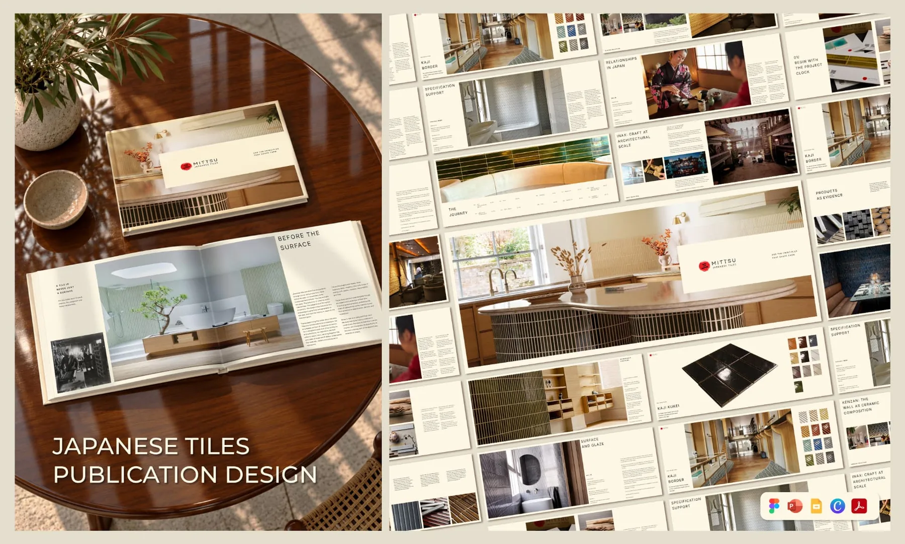
- Publication Art Direction
- Editorial Design
- Layout Systems
- Typography
- Image Composition
- Digital Publication Design
From supplied knowledge to a coherent editorial journey.
Mittsu Japanese Tiles needed a digital publication that could communicate the depth behind its architectural tile collections without reading like a catalogue.
The publication had to connect Japanese philosophy, makers, product collections and practical specification guidance for an audience of architects and interior designers.
E11EVEN TECHNOLOGIES translated the supplied manuscript and imagery into Publication 01: a 76-page digital edition with a reusable editorial foundation for future material storytelling.
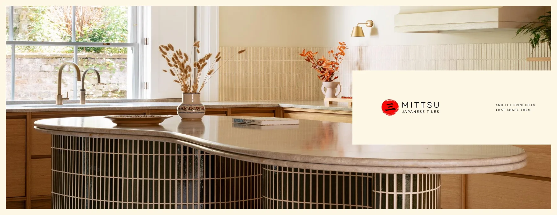
A large body of content needed one calm reading system.
The content moved between philosophy, production knowledge, maker relationships, product evidence and specification guidance. Each layer served a different role, but the reader needed to experience it as one connected narrative.
For architects and interior designers, the publication also had to balance inspiration with practical clarity. It needed enough space for atmosphere, while making product decisions, lead times and handovers easy to understand.
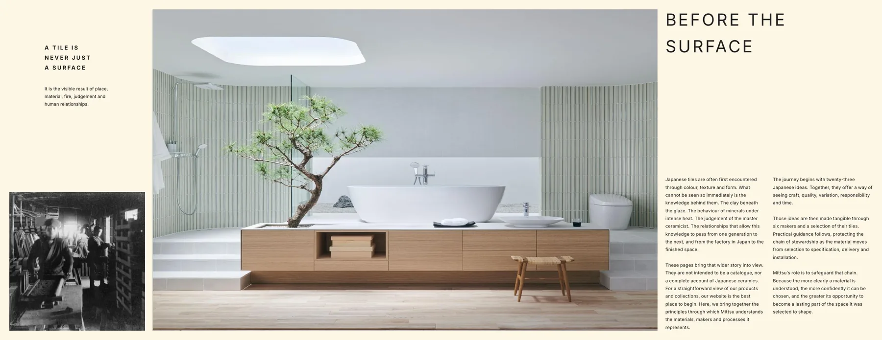
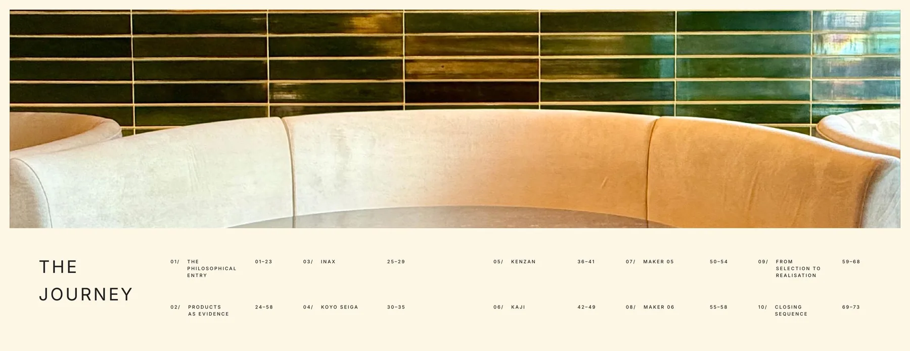
Material Narrative: warm, restrained and architectural.
The design direction uses warm ivory backgrounds, restrained typography and generous negative space to slow the reader down and place attention on material detail.
Rather than over-designing the pages, the system frames supplied imagery with quiet rhythm. Tile textures, interiors, makers and specification details become the proof points.
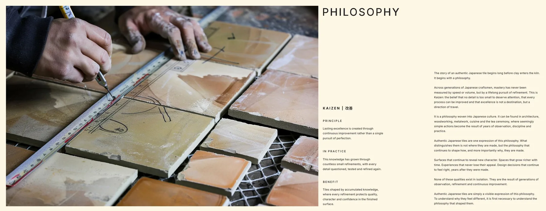
Principle
Each Japanese concept is introduced as an organizing idea, giving the publication a philosophical spine rather than a product-first sequence.
In Practice
The abstract idea is translated into how materials, makers, processes and project decisions actually behave.
Benefit
The reader sees why the idea matters when selecting, specifying and protecting a surface in a real interior project.
Recurring layouts that could hold philosophy, makers, products and guidance.
We established a modular system before expanding the publication. Large image-led openings create atmosphere. Side-column structures carry principles and key takeaways. Product pages use consistent detail zones so collections remain comparable.
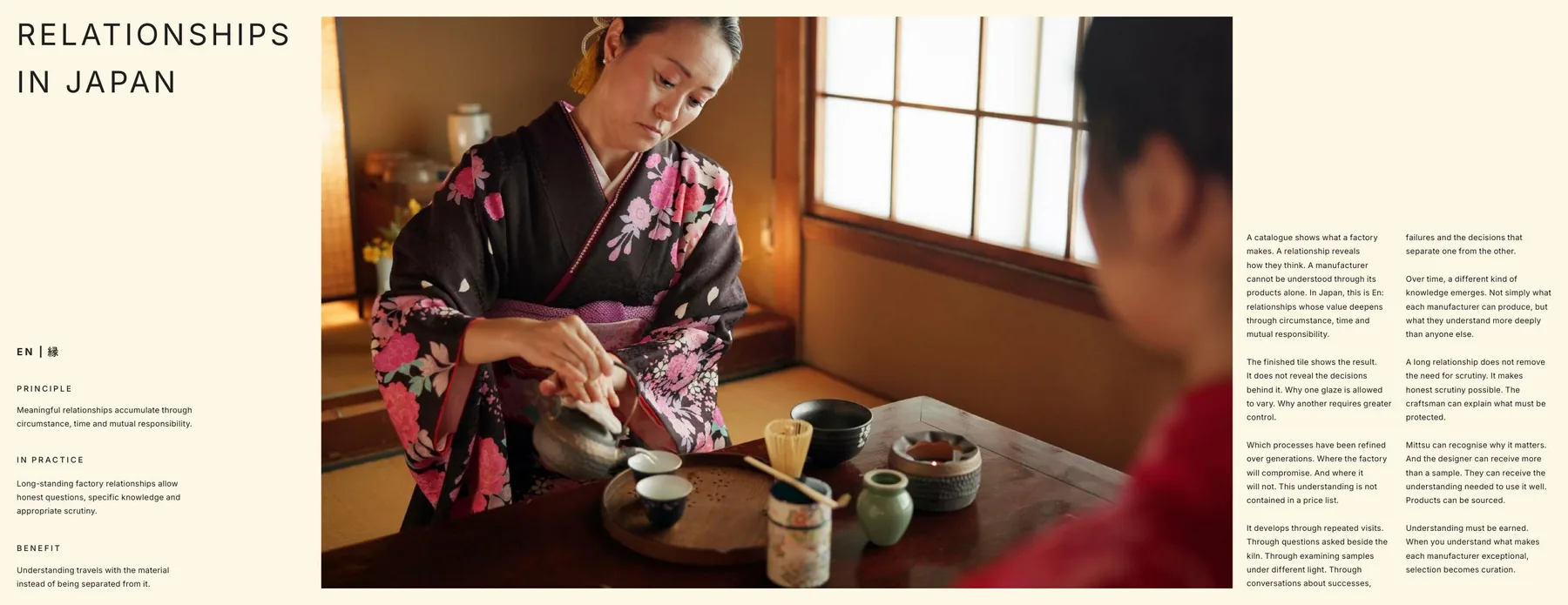
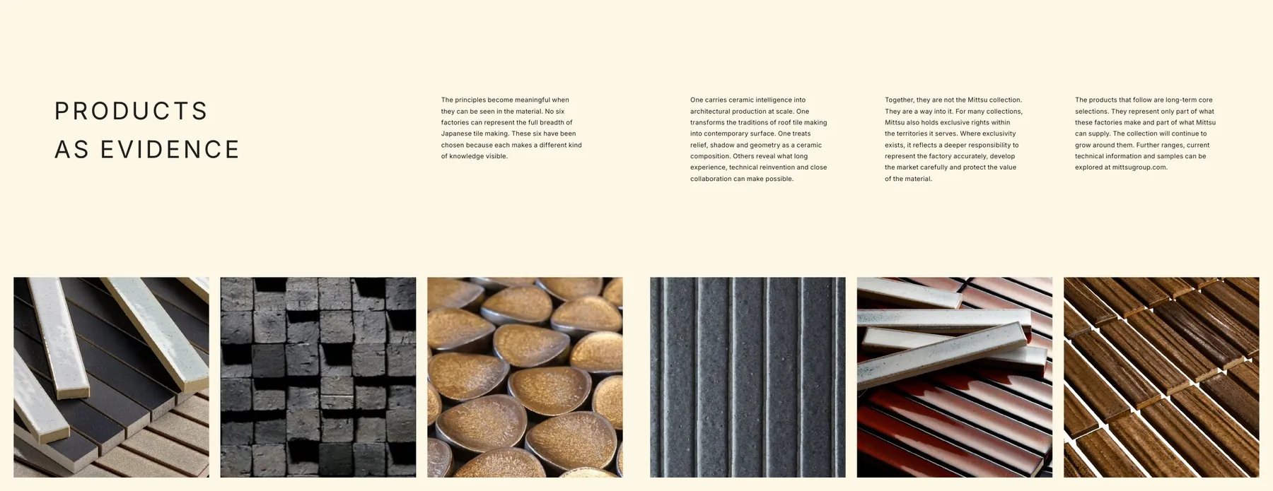
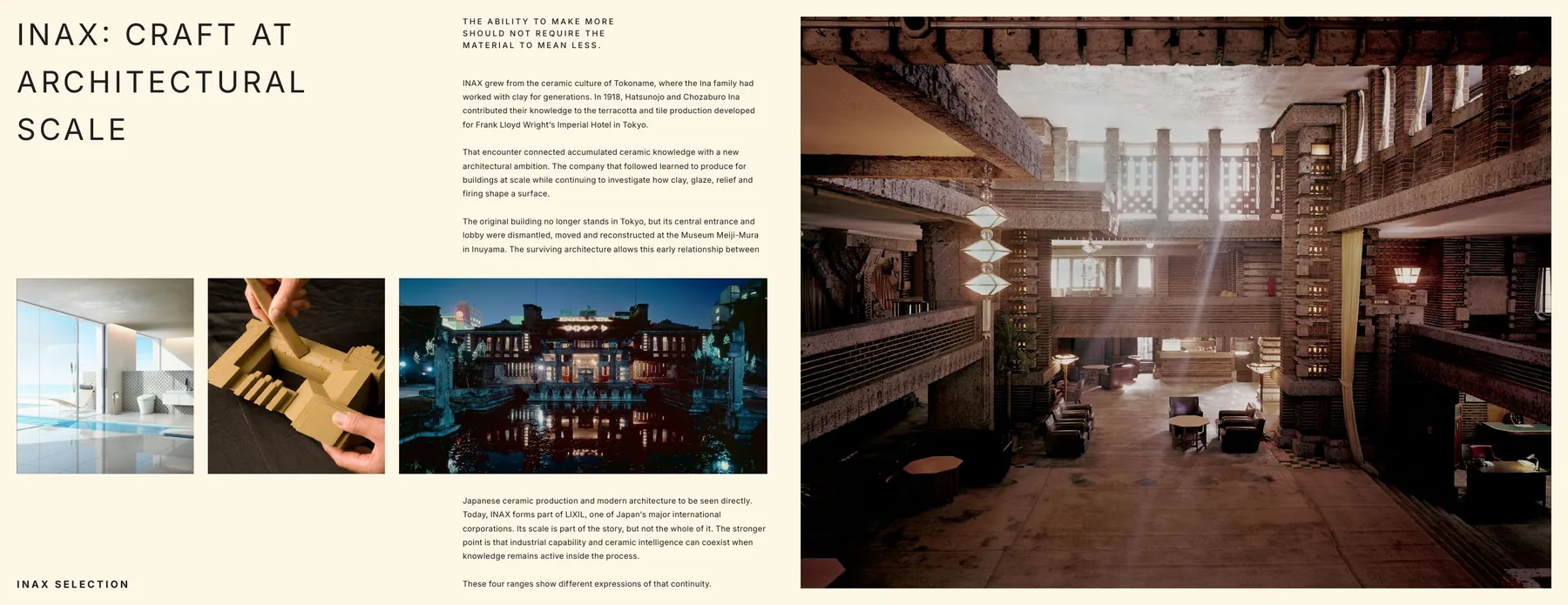
Small systems made dense information feel intentional.
Typographic hierarchy
Large spaced headings, compact labels and disciplined body columns help the reader move from atmosphere to detail without losing orientation.
Image scale
Spreads alternate between full-width environments, material close-ups and supporting details so the publication feels architectural rather than purely decorative.
Product details
Collections are shown with imagery, colour references and short positioning copy, allowing designers to compare material character quickly.
Pacing
Quiet pages and dense guidance pages are deliberately alternated, giving a 76-page digital publication enough rhythm to remain readable.
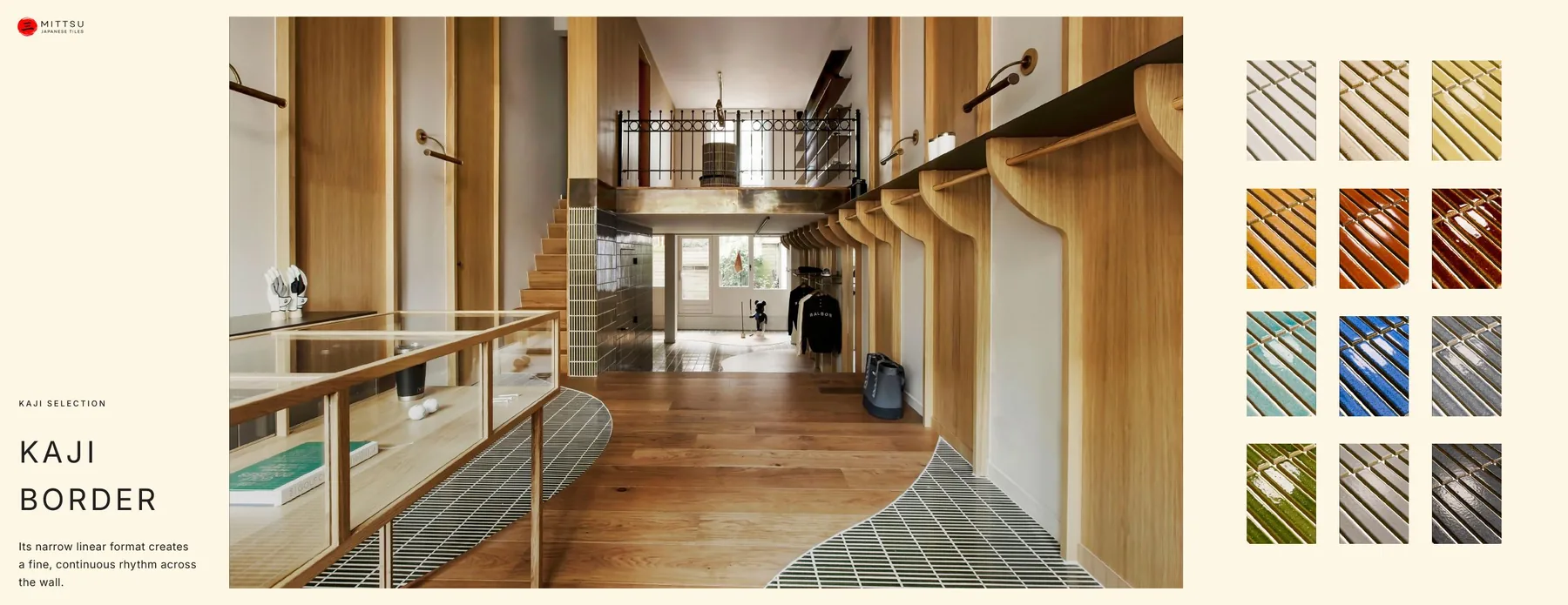
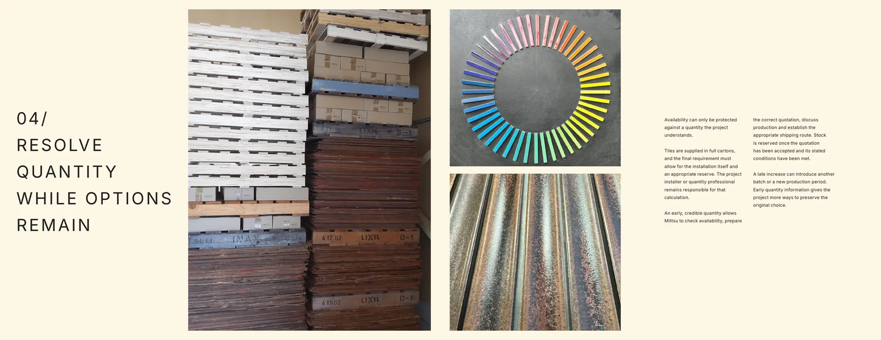
Build the rhythm first. Then extend it across the publication.
The process began by defining core page types: philosophical entries, maker profiles, product presentations and specification guidance. Once those formats were stable, the system could expand without every page needing to be reinvented.
As the publication developed, copy refinements and photography updates were absorbed into the system. The layouts remained consistent while allowing each spread to respond to its content.
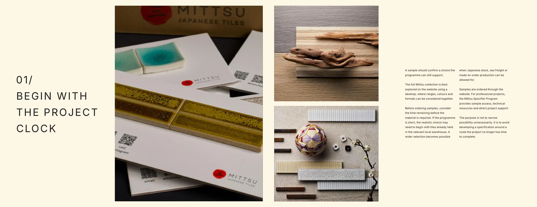
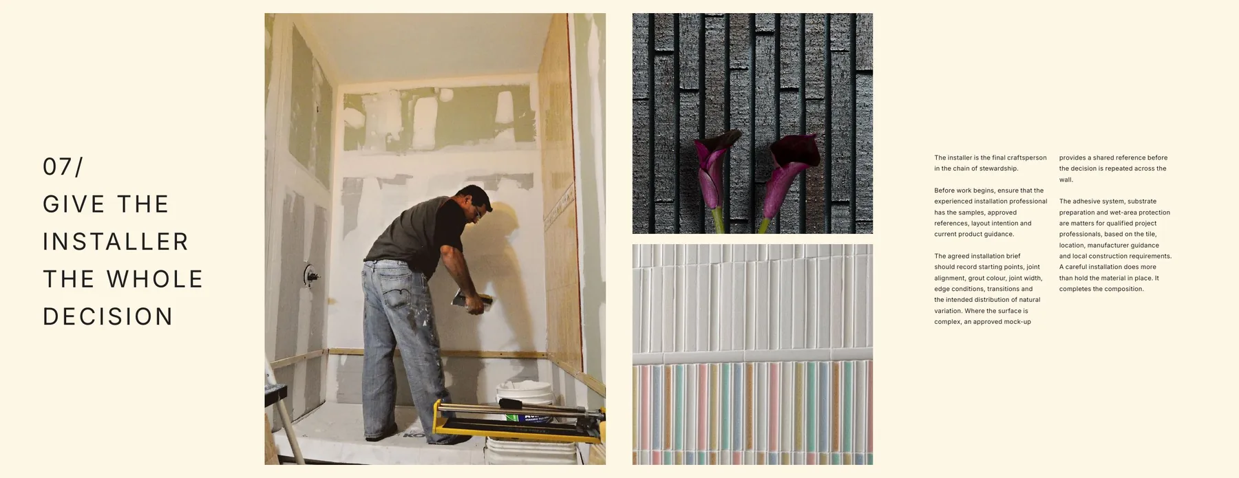
A completed digital edition and a reusable editorial foundation.
The final delivery included the completed digital PDF and editable Adobe InDesign source files, giving Mittsu a polished publication and a system that can support future editorial updates.
The design helps architects and interior designers understand not just what the tiles look like, but why the materials, makers and specification process matter.
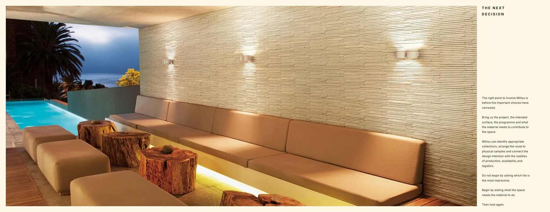
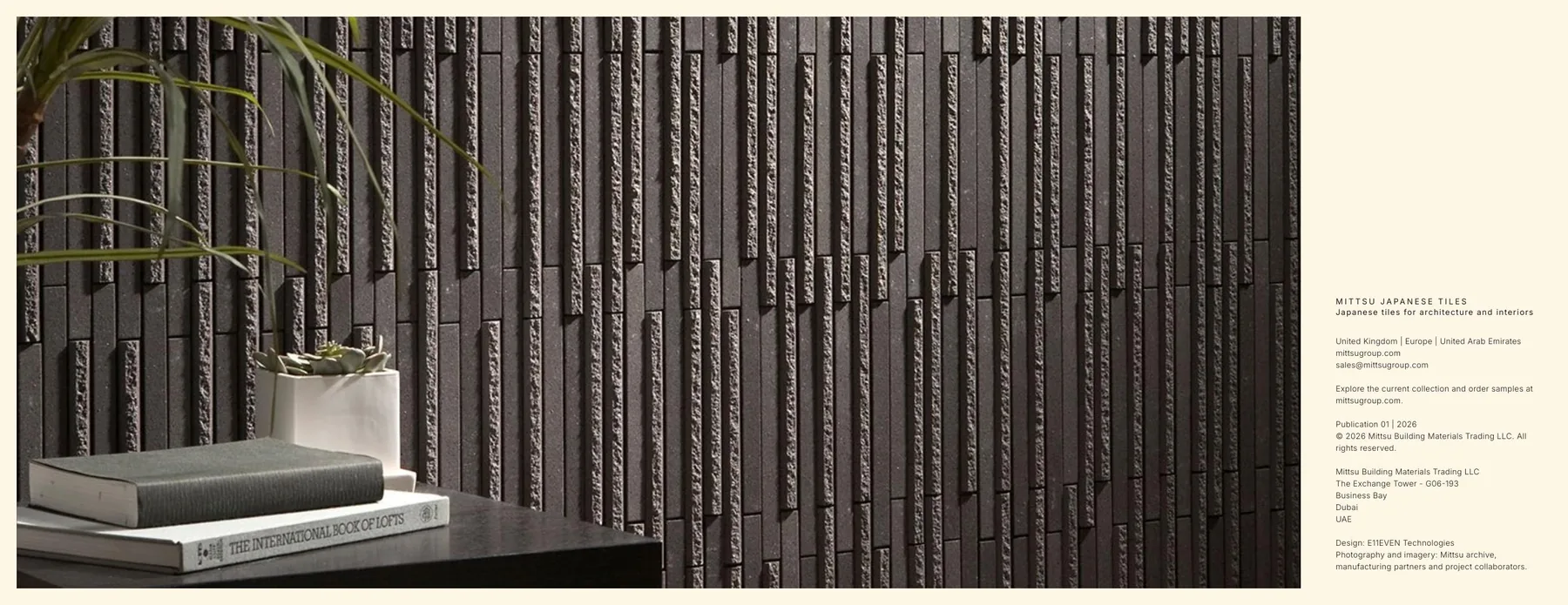
A material-led story can do more than present products. It can help the right audience understand what makes a specification worth protecting.
MDGeniusAI
Building the future operating system for healthcare intelligence.
Ready to shape your next brand system?
Book a 30-minute discovery call. We'll map your brand, audit your current presence, and outline what a partnership with E11EVEN looks like.