Ship-it.live
Launching digital transformation with confidence.

The brief.
Ship-it.live is a modern technology company specialising in digital transformation, custom software development, cloud infrastructure, and enterprise system integration. Serving clients across Europe, Türkiye, and South Africa, the company helps organisations streamline operations, modernise business processes, and build scalable digital ecosystems.
While their technical capabilities were extensive, their brand presence did not fully reflect the sophistication, innovation, and reliability behind their services. The challenge was to create a future-ready identity that would position Ship-it.live as a strategic technology partner, not simply another software development company.
The result was a complete brand transformation including Brand Strategy, Logo Design, Visual Identity System, Website Design, Logo Animation, and Brand Guidelines.
A crowded technology market with very few real differentiators.
The SaaS and technology services market is crowded with businesses competing on similar promises: digital transformation, custom software development, cloud migration, process automation, and enterprise integrations. Most technology companies rely on generic visual identities, technical messaging, and outdated websites that fail to communicate their strategic value.
- Lack of clear differentiation in a competitive technology market.
- Limited visual connection between the brand name and its services.
- Need for a scalable identity system across software products and corporate use.
- Desire to appeal to modern businesses seeking long-term technology partners.
- Capacity to support future SaaS product launches.
Three audiences. One shared driver: trust.
Through discovery sessions and stakeholder workshops, we identified three primary audience segments. Across all of them, trust, reliability, technical expertise, and scalability emerged as the strongest purchasing drivers.
Own the verb in the name. Ship it.
The strongest opportunity emerged from the company name itself. “Ship-it” represents deployment, launch, execution, and progress. We repositioned the brand as a strategic digital transformation partner helping businesses move ideas into live, scalable technology solutions.
A geometric rocket, engineered for software deployment.
The final symbol was designed as a minimal geometric rocket inspired by software deployment, product launches, innovation, digital acceleration, and future growth. Subtle structural references to Git branching systems and digital architecture introduced a deeper connection to modern software development without becoming literal.
One mark, three lockups, infinite surfaces.
The system includes a primary vertical lockup, a horizontal lockup, and a standalone icon. Each version was built to perform across app icons, splash screens, web headers, and corporate communications.


Cyber Purple over Graphite. A futuristic dark mode.
The palette was inspired by futuristic technology environments. Deep Black, Graphite Grey, and Soft White anchor the system, while Cyber Purple and Violet Glow introduce motion and energy. The result is a premium, cyberpunk-inspired aesthetic that feels modern without becoming trendy.
Raleway and Inter. Geometric meets functional.
Raleway carries display and headlines with geometric precision. Inter handles UI, body, and product copy. Together they reinforce clarity, technical sophistication, and contemporary digital experiences across product and marketing surfaces.
Convert visitors from curiosity to consultation.
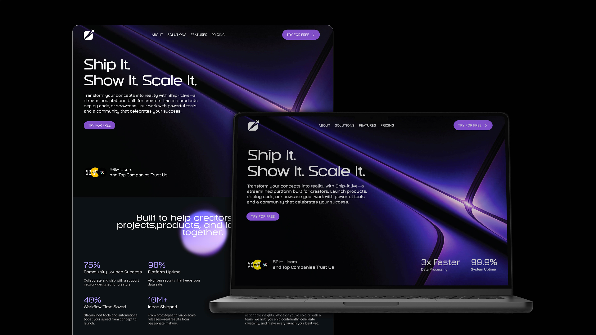
The website was designed around one primary objective: turn curious visitors into scheduled consultations. The architecture was simplified into Services, Industries, Process, Case Studies, Technology Expertise, and Contact, creating a clear journey for decision-makers evaluating a technology partner.
A system built to live across every surface.
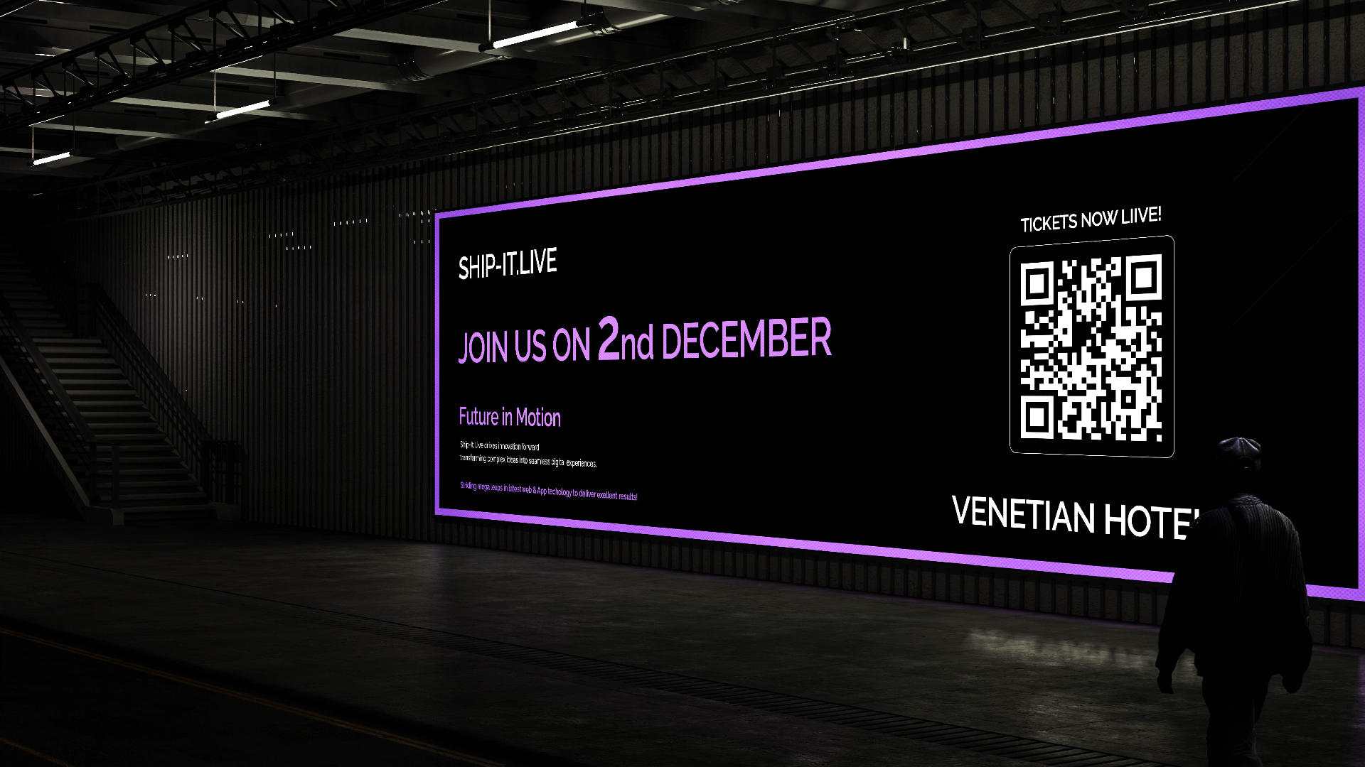
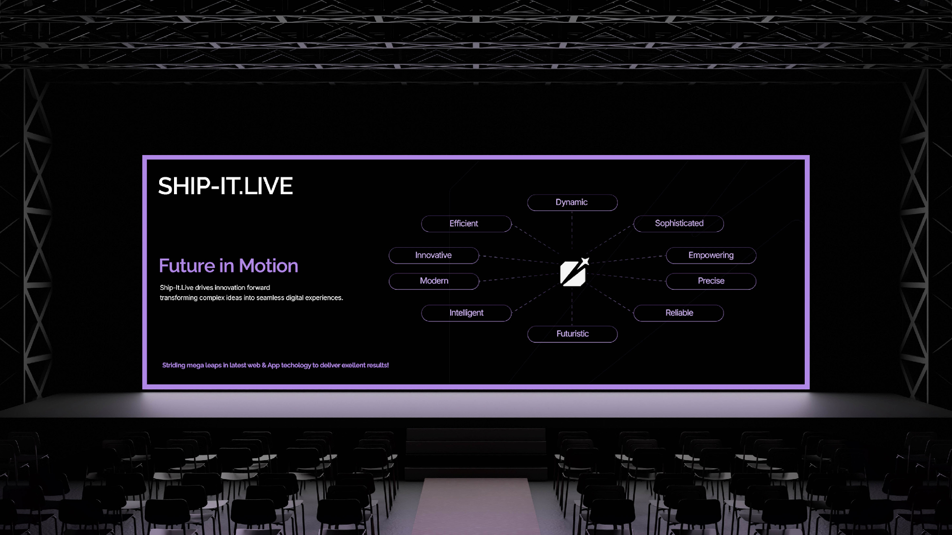
From product UI to event billboards and stage screens, the identity was engineered to remain recognisable across every environment Ship-it.live operates in.
A confident technology brand, ready for what ships next.
Wytha
Building the intelligence layer for modern gaming.
Want a system like this for your brand?
Book a 30-minute discovery call. We'll map your brand, audit your current presence, and outline what a partnership with E11EVEN looks like.