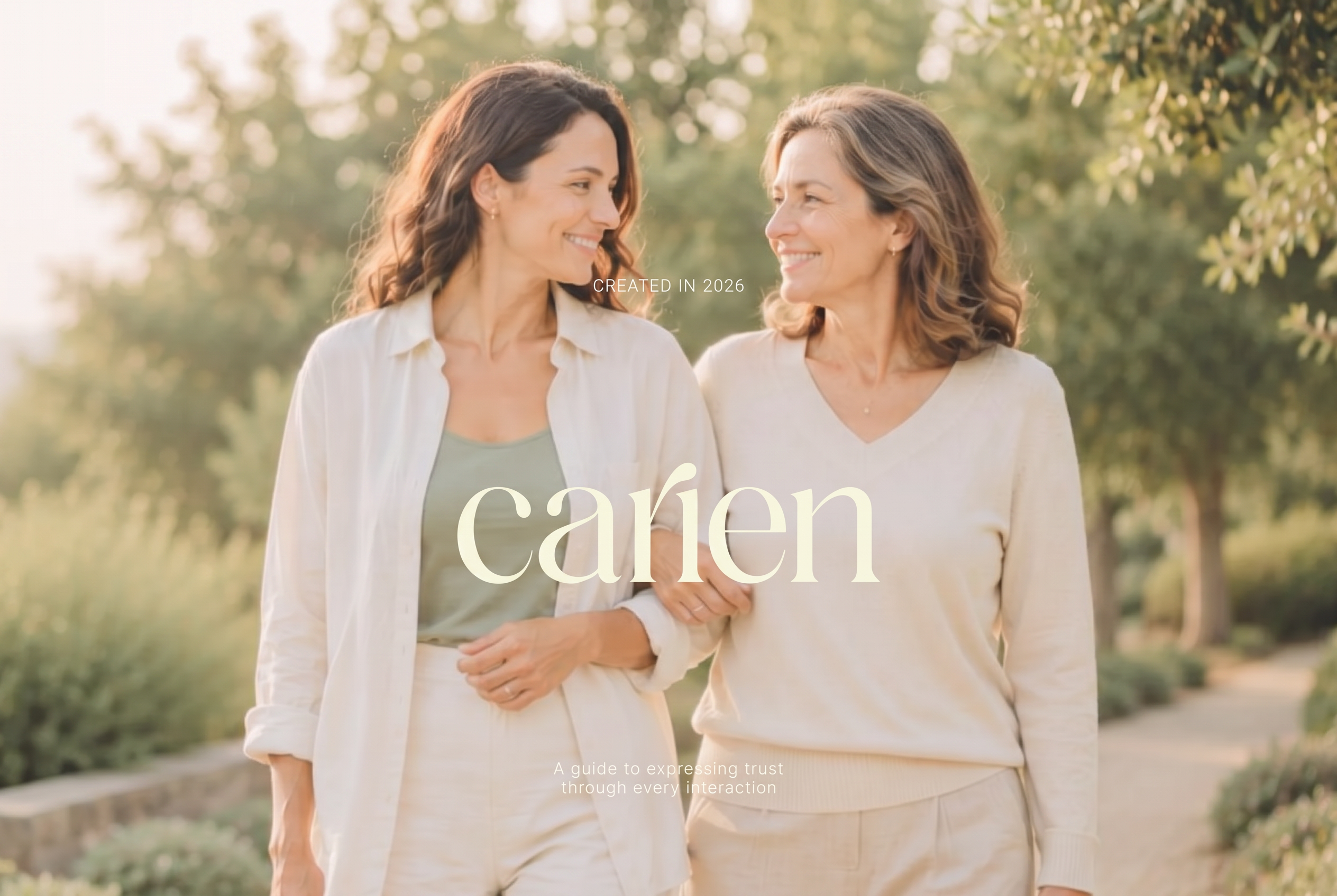
Case Study / 2026 Family Care & Education
Carien: Designing trust for life’s most difficult care decisions.
A calm, editorial brand identity created for a guidance and education company helping individuals and families navigate aging, caregiving and major life care transitions with greater clarity, compassion and confidence.
- Client
- Carien
- Industry
- Family Care Guidance & Education
- Year
- 2026
- Engagement
- Brand Identity + Visual System
Services
- Logo Design
- Brand Guidelines
- Business Card
- Letterhead
- Email Signature
- Social Media Templates
- Presentation Design
A brand for the moments when the path forward feels uncertain.
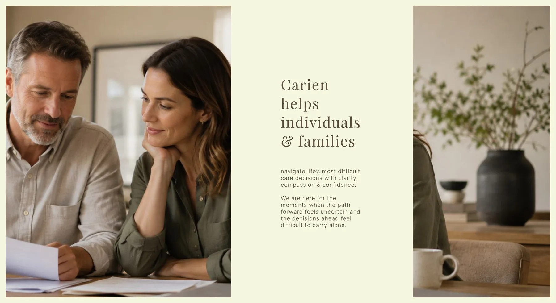
Carien is a guidance and education company created to support individuals and families through some of life’s most emotionally challenging care decisions.
Its initial resources include Companion books, educational materials and practical planning tools for families navigating aging, caregiving, dementia care, senior-living transitions and other significant care decisions.
However, Carien was never intended to remain simply a collection of guides.
The long-term vision is to build a trusted organization that can grow into digital guidance, educational programs, community resources, healthcare partnerships and new forms of support.
E11EVEN TECHNOLOGIES was engaged to translate that vision into a complete caregiving brand identity and visual system, one that could feel equally appropriate in a family resource, a professional healthcare partnership, an educational presentation or a future digital platform.
The goal wasn’t to make difficult decisions disappear. It was to help those decisions feel clearer and less lonely.
Compassionate, without becoming sentimental.
The care and healthcare sectors often rely on the same familiar visual language: corporate blue, medical symbols, hearts, staged photographs and overly reassuring messages.
Those conventions would not represent Carien.
The identity needed to communicate compassion without sentimentality, professionalism without corporate coldness and confidence without becoming authoritative.
It also needed to avoid feeling like a technology startup, luxury wellness brand, meditation app or traditional senior-care company.
Most importantly, the identity needed to create an immediate emotional response:
“I feel safe.”
Not simply:
“That’s a cool logo.”
Emotional safety
Create a reassuring experience without using predictable healthcare imagery or sentimental design.
Institutional trust
Establish credibility and permanence without making the brand feel cold, clinical or corporate.
Distinctive restraint
Create recognition through typography, consistency and careful detail rather than a forced abstract symbol.
Long-term flexibility
Build a visual system capable of supporting educational resources, digital products, partnerships, presentations and future brand extensions.
The name became the most important brand asset.
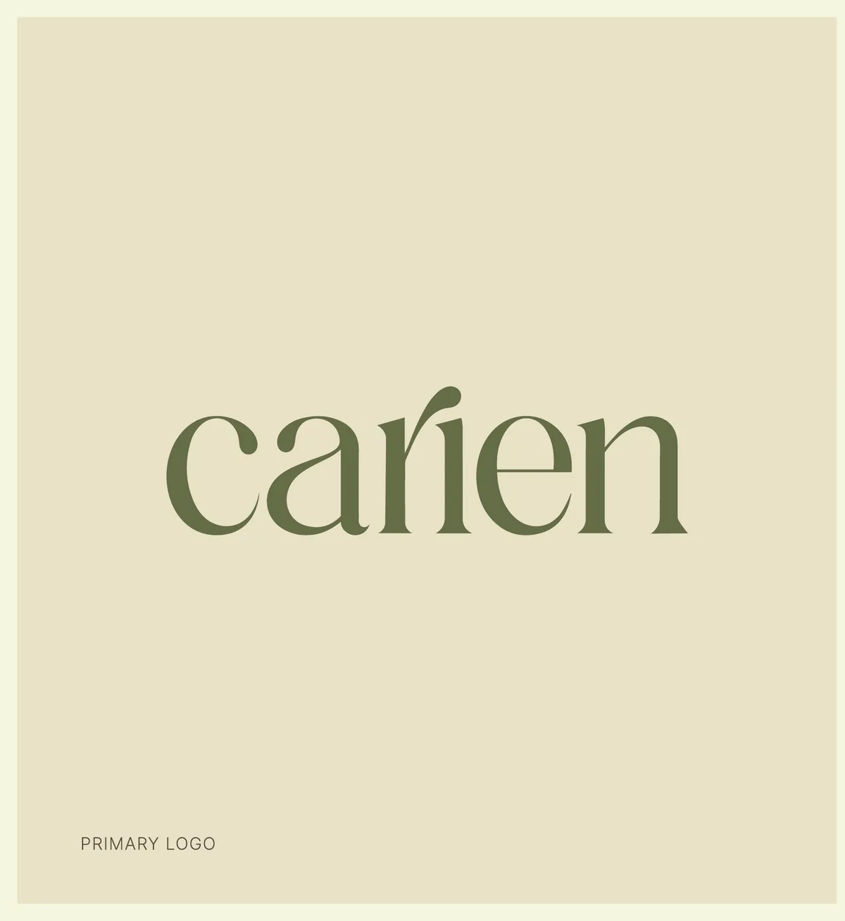
Through discovery and collaborative creative exploration, one insight became increasingly clear: Carien did not need an icon to explain the brand.
The name itself needed to carry the identity.
Rather than forcing a literal care symbol or abstract technology mark into the logo, we shifted the creative direction toward an elegant typography-led wordmark.
The focus became timelessness rather than novelty.
Each refinement was evaluated against the emotional experience the brand needed to create: calm, stability, guidance, human warmth and quiet confidence.
This collaborative process also helped sharpen Carien’s positioning. The brand moved beyond being presented primarily through its products and became centered on its deeper purpose, helping families make difficult care decisions with clarity and confidence.
The name Carien is the asset.
A wordmark does not need to demand attention to become recognizable. It can earn recognition over time through clarity, restraint and consistent use.
Designing trust through clarity, consistency and care.
Every element of the Carien identity was designed around the emotional transition the organization wants to create.
Before Carien
- Uncertain
- Overwhelmed
- Unsure what comes next
- Facing difficult decisions alone
After Carien
- Understood
- Supported
- Reassured
- More confident moving forward
Clarity before complexity
Information should help people find their footing, not add to the weight of the decision.
Guidance before instruction
Carien helps families understand their options without telling them what they must choose.
Compassion without sentimentality
The brand acknowledges emotional difficulty while remaining composed, practical and respectful.
Presence when it matters
Every touchpoint should feel considered, accessible and supportive.
Confidence through understanding
Clear guidance allows people to prepare, decide and move forward with greater confidence.
A wordmark designed to earn recognition quietly.
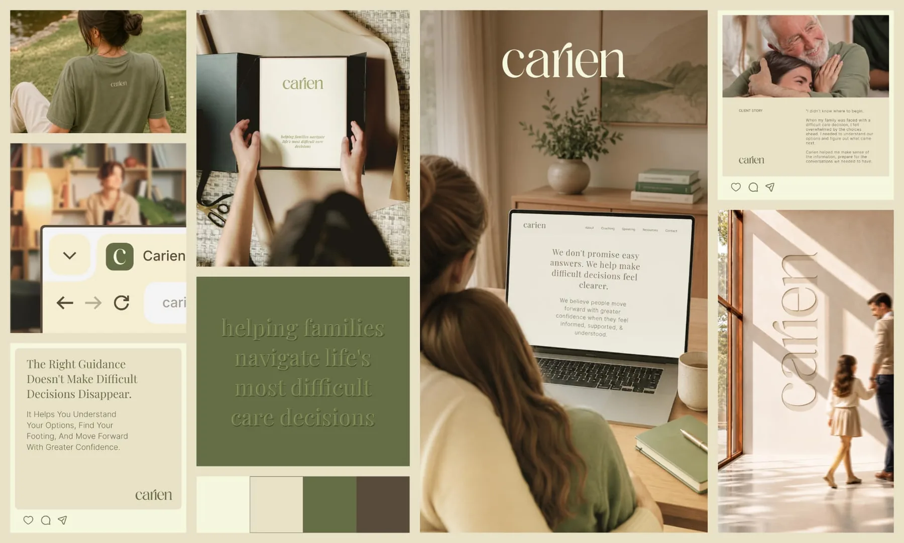
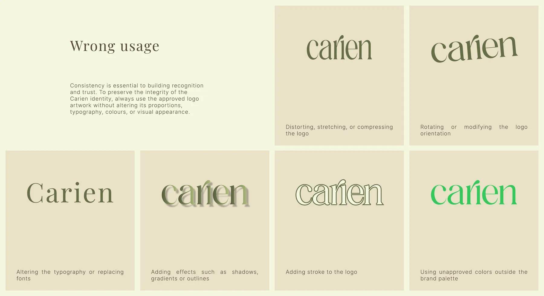
The Carien wordmark is the primary expression of the brand.
Its refined letterforms give the name a calm and assured presence while avoiding literal references to healthcare, caregiving or aging.
Instead of asking a symbol to carry the entire story, the identity gives the Carien name the space and confidence to stand on its own.
A supporting “C” submark and favicon extend the system into smaller digital environments while remaining visually connected to the primary wordmark.
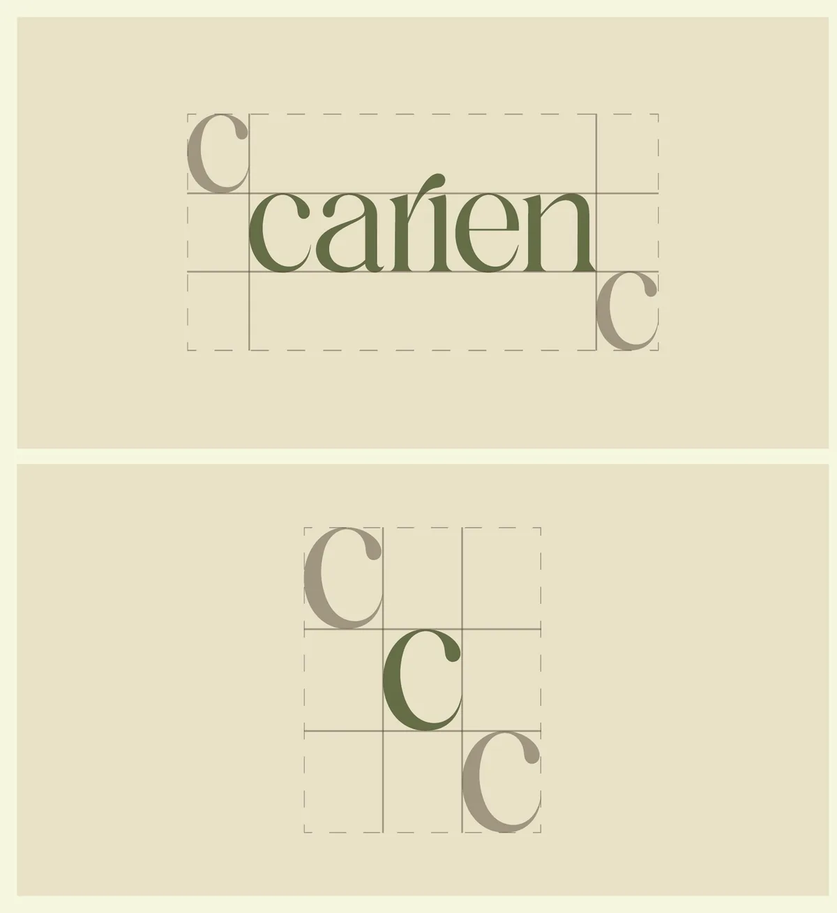
The result is a logo system that feels distinctive without appearing overly designed. Quiet in its presence, clear in its purpose and flexible enough to build recognition over time.
Trust isn’t built through decoration. It is built through clarity, consistency and care.
Editorial warmth. Practical clarity.

Typography gives Carien its calm, considered and human voice.
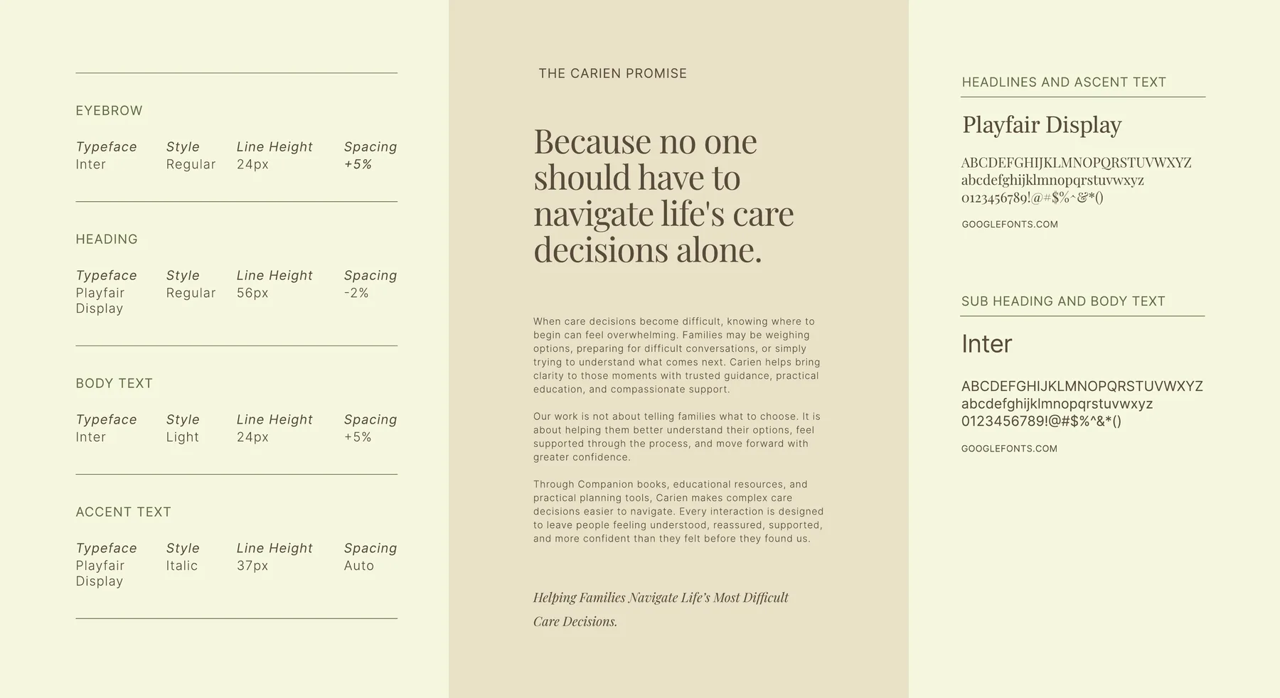
Playfair Display introduces an editorial quality across headlines, expressive statements and moments that require warmth or reflection.
Inter provides clarity, structure and high legibility across body copy, educational resources, social content, presentations and future digital experiences.
Together, the serif and sans-serif typography create a balance between emotional warmth and practical guidance.
Typography is never used simply as decoration. Hierarchy, spacing and generous line height help complex information feel more approachable and easier to understand.
| Role | Typeface | Style | Line height | Spacing |
|---|---|---|---|---|
| Eyebrow | Inter | Regular | 24 px | +3% |
| Heading | Playfair Display | Regular | 56 px | 2% |
| Body text | Inter | Light | 24 px | +5% |
| Accent text | Playfair Display | Italic | 37 px | Auto |
Color should create calm before it creates distinction.
The final palette moved away from conventional healthcare blue and overly dark luxury styling. Instead, we developed a lighter and more hopeful color system built from warm, natural tones.
Ivory creates openness, optimism and breathing room. Oatmeal adds softness and quiet depth.
Muted olive introduces trust, stability and intentional emphasis. Muted brown provides a warmer alternative to black for typography and core brand elements.
The colors work together to create a brand that feels sophisticated and credible while remaining emotionally reassuring.
#F5F7DF
Primary foundation
#E9E1C7
Supporting neutral
#656D46
Primary brand color
#594B3B
Accent and primary text color
We don’t photograph care. We photograph connection.
Carien’s photography direction focuses on the relationships that help people navigate difficult moments.
The audience is not defined only by age. It includes adult children, spouses, caregivers and family members trying to understand their options and support someone they love.
Images therefore focus on genuine conversations, companionship, guidance, reassurance and quiet moments of connection.
Natural light, lived-in environments and authentic expressions help the brand feel human without becoming staged, clinical or overly emotional.
The goal is not to dramatize the difficulty of care. It is to communicate that no one has to navigate it alone.
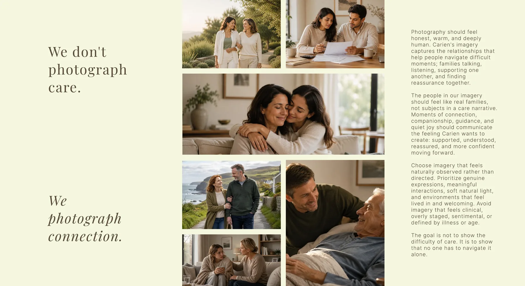
Note: The imagery shown here is AI generated and used to illustrate the photography direction. Carien’s actual brand photography shoot is still pending.
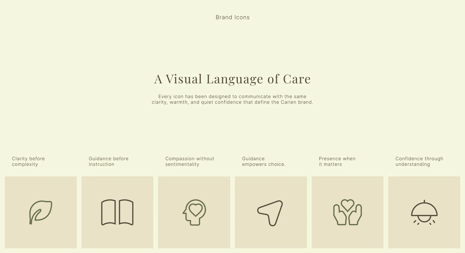
A visual language of care
A custom icon family was created to communicate Carien’s principles with the same clarity and restraint as the wider identity.
- Clarity before complexity
- Guidance before instruction
- Compassion without sentimentality
- Guidance empowers choice
- Presence when it matters
- Confidence through understanding
One identity, designed for every interaction.
A trustworthy brand is not built through one logo placement. It is built through the consistency of every interaction.
The Carien identity was extended across practical applications that the organization could begin using immediately while establishing a foundation for future growth, from stationery design to social media design and business presentation design.
Brand guidelines
A comprehensive brand book documenting the brand purpose, logo system, typography, colour, imagery, icons, layout principles and usage standards.
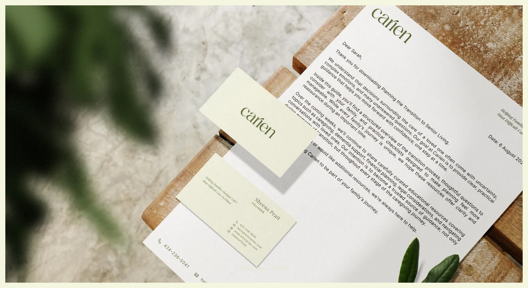
Business card
A restrained, professional business card designed for meetings, partnerships and speaking opportunities.
Letterhead
A clear and credible document system suitable for formal communications, educational materials and professional partnerships.
Email signature
A consistent digital signature system that carries the brand into everyday communication.
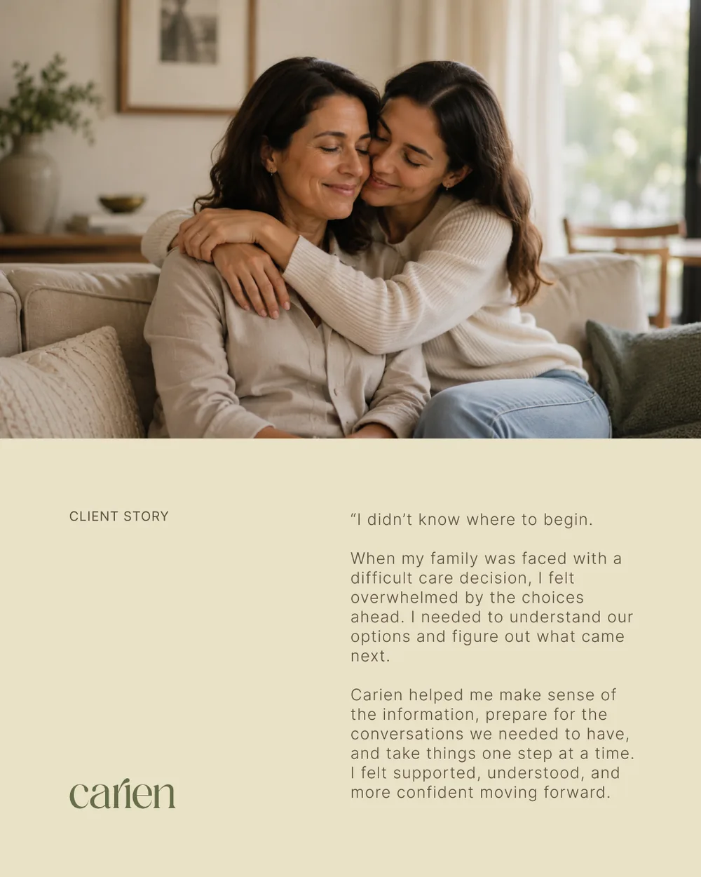
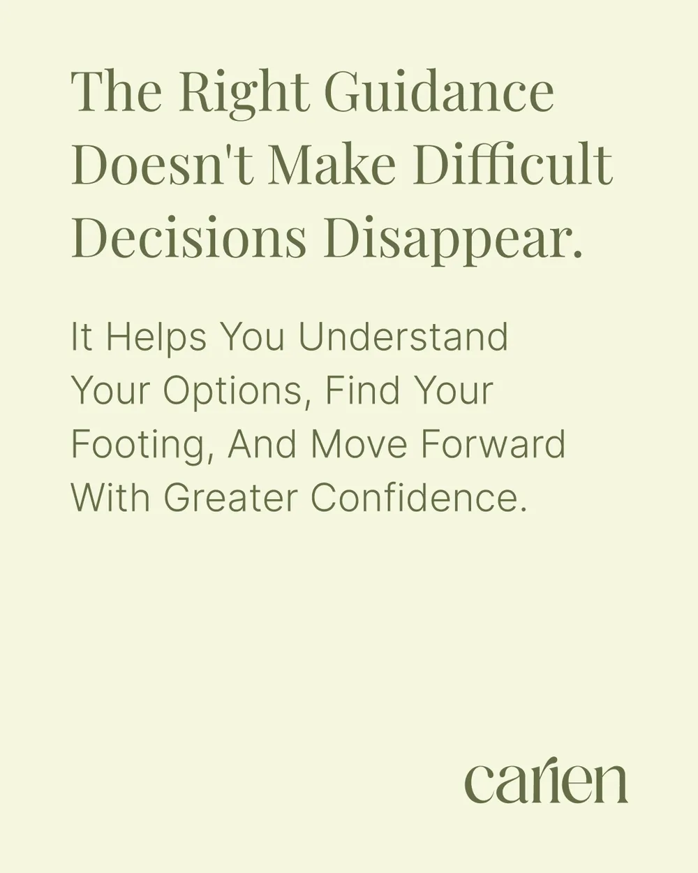
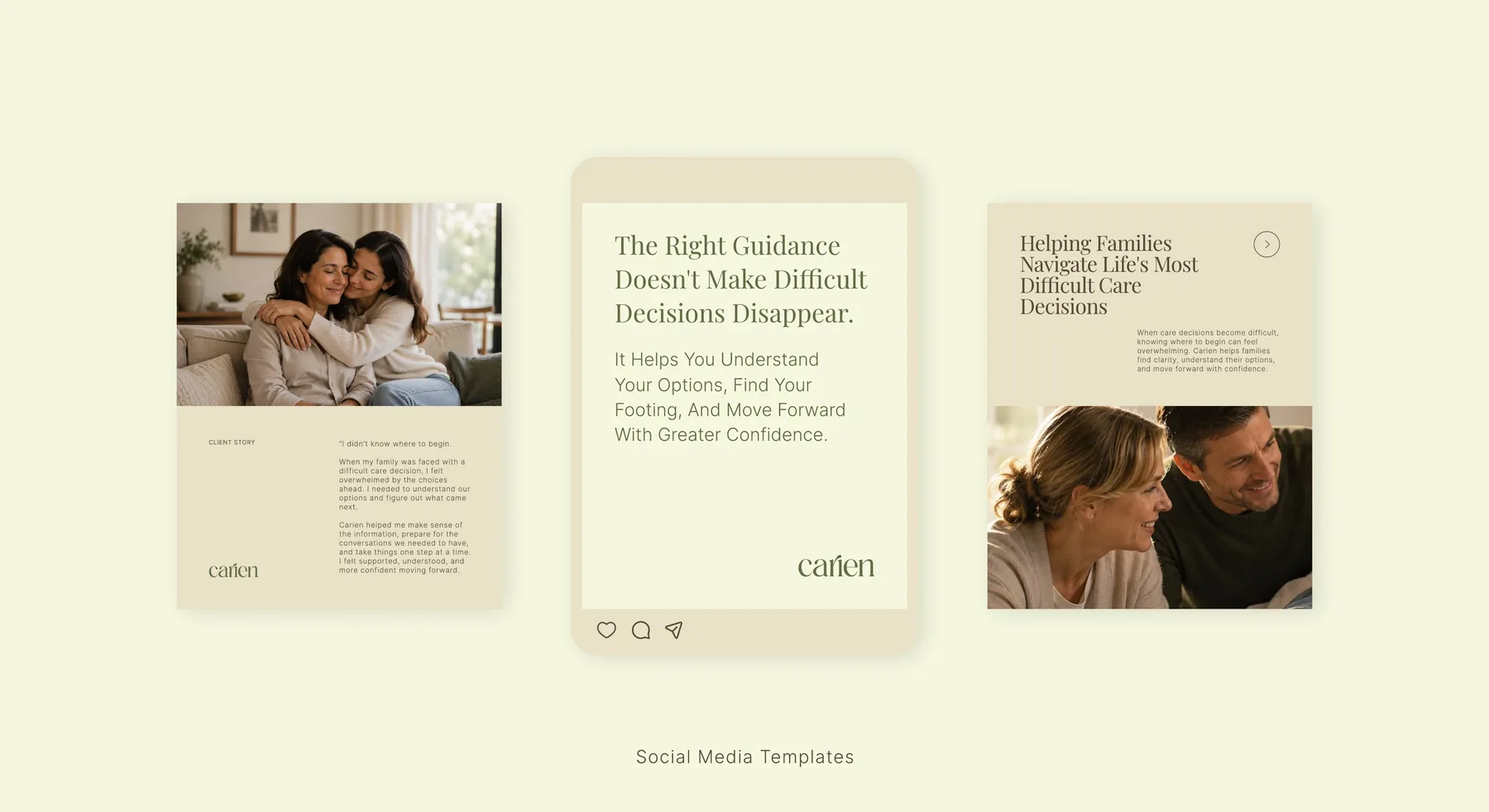
Social media templates
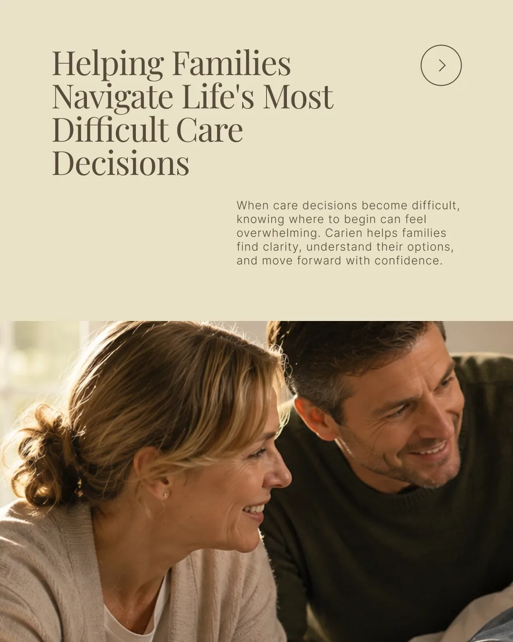
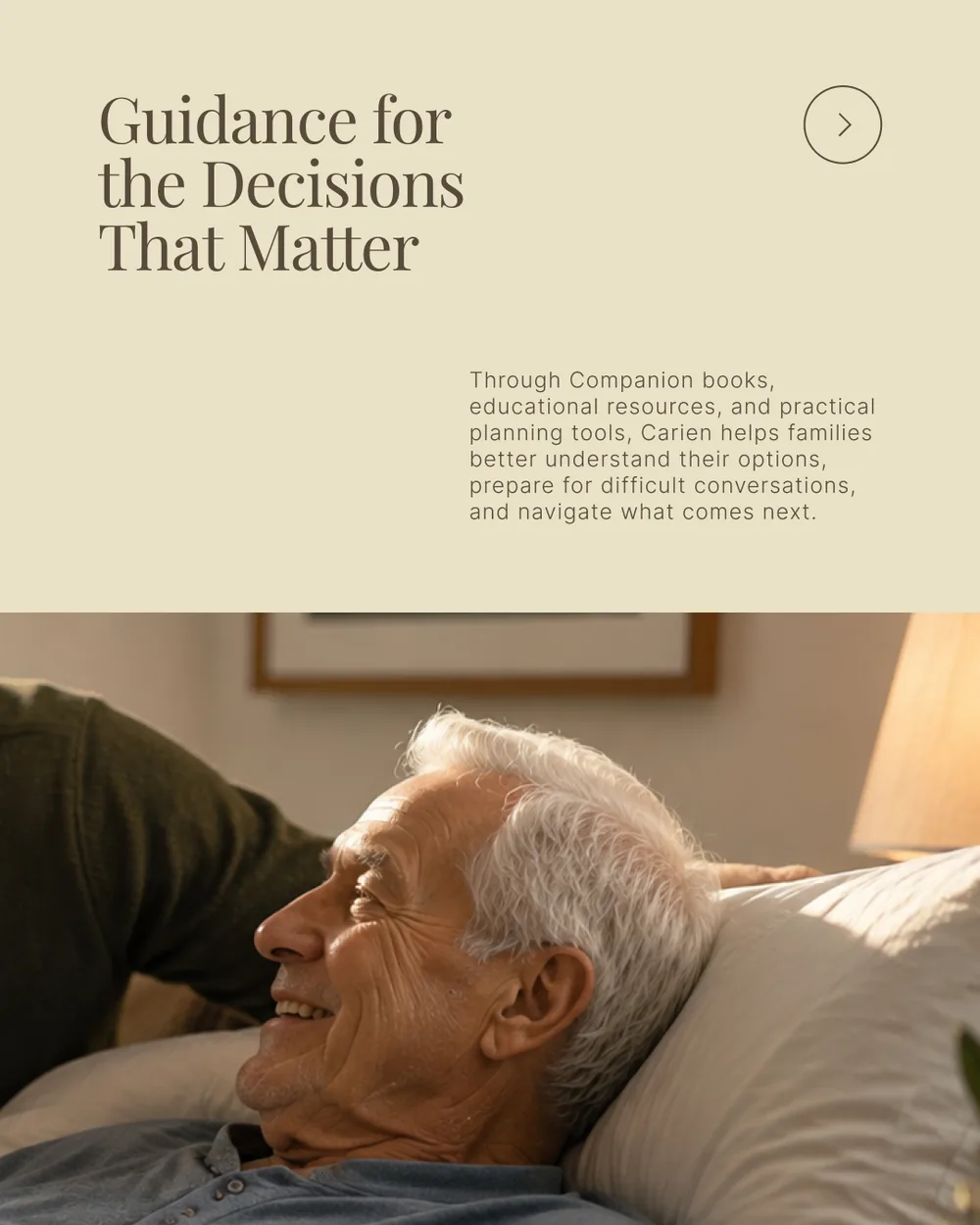
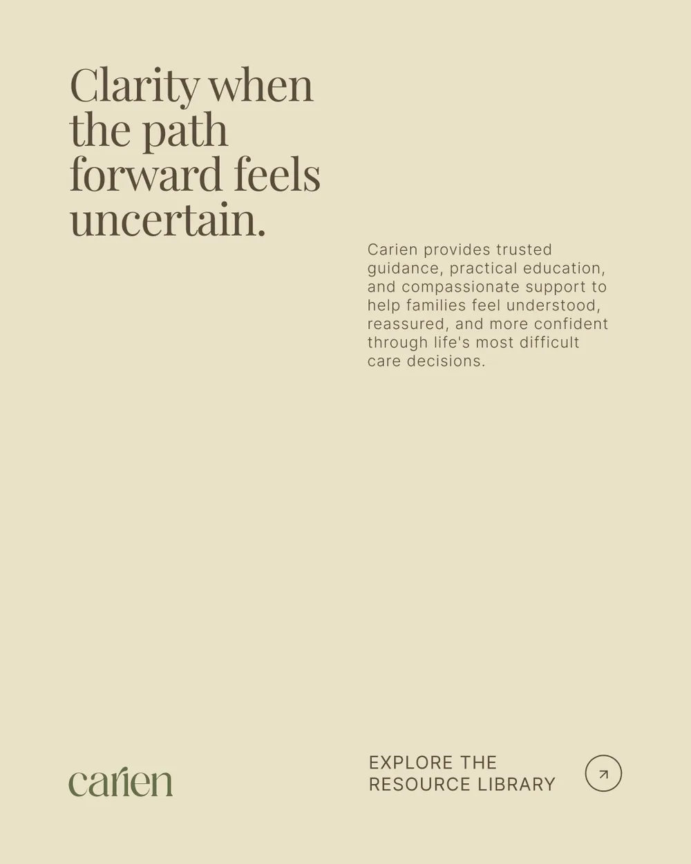
Reusable social media designs for educational content, guidance, brand stories and future resources.
A trusted foundation built to grow with Carien.
The completed identity gives Carien a cohesive visual foundation that feels credible, sophisticated, warm and unmistakably human.
Emotional alignment
The final identity reflects the feelings Carien wants to create: calm, reassurance, understanding and confidence.
Visual consistency
The logo, colour, typography, photography, icons and applications now work together as one recognizable system.
Professional credibility
The identity is appropriate for educational resources, family-facing communications, healthcare partnerships and executive presentations.
Long-term flexibility
The system can grow across future digital products, community initiatives, educational programs, AI-powered guidance and new partnerships without losing its core character.
“The updated color palette, typography, photography, and overall direction feel timeless, calm, and trustworthy.”
Trust isn’t built in a single interaction. It is built through every interaction.
That is the Carien brand.
Building a brand people need to trust?
We create thoughtful brand identity systems for healthcare, education, technology and service-led organizations that need to communicate with greater clarity, credibility and consistency.
Or browse more brand identity case studies.
Mittsu Japanese Tiles
Publication design connecting Japanese craftsmanship with architectural understanding.